
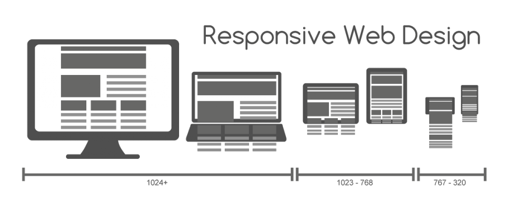
There is fair amount of challenges that arise when dealing with responsive images. All of the websites we build have to be responsive. And our lives as developers are not getting any easier as the number of different devices and potential screen resolutions increase. The high-resolution arms race seems to be never-ending as vendors try to top one another with innovations in laptop and mobile device screens. New devices such as TVs and smartwatches are entering the market, making the race even more complex.
Some clients only require the images to be responsive. Some focus on the looks too much and some do not care at all. It’s our job to inform the client about possible solutions to the problem. So this is the article we dedicate to our beloved web designers who could find this tool invaluable. We are certain that by being on the same page we’ll be able to work more efficiently and produce better results.
Issues with responsive images:
Now there is a great tool which we recommend for our clients and we use it ourselves. Responsive image breakpoint generator. The tool allows you to process your images, which is useful if you have a reasonable amount of statically uploaded images. To generate breakpoints for images uploaded by users, you need to programmatically generate them from your code. For each uploaded image, you probably need to call an API to generate the breakpoints, store or cache them on your side and then build your HTML5 or CSS snippets according to these breakpoints. You can specify settings such as the width range, file size step, maximum number of images and request one or more image transformations to apply on the original image. Such transformations include aspect ratio-based cropping, face detection-based cropping and applying various image effects, filters and optimisations.